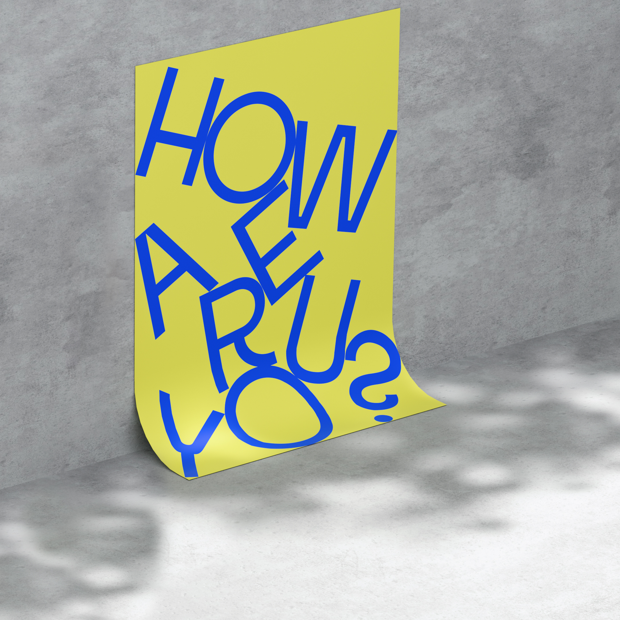
Thanks for getting the word out, Comic Sans. But now it’s time to switch it up and direct the spotlight towards the new dyslexia-friendly and beautiful typeface on the scene. That’s right we’re not only talking the talk but also walking the walk. Which is why we’ve taken our design challenge to heart and created, together with renowned designer Daniel Brokstad, a typeface that is not only dyslexia-friendly but also appealing to designers.
Inconstant Regular was created to be friendly to both dyslexia and designers alike. Through its irregular shapes, built-in variable accessibility features and contextual alternatives, the font can be tailored to individual needs and desired typographic aesthetic. In turn, allowing everyone to find their perfect mix between beauty and legibility.


It is designed with contextual alternatives that cycle through 3 different glyph sets to help the characters stand out. All sets share various parameters to create differentiation between letters: from bigger apertures, wider tracking, slanted letters, or taller ascenders. Inconstant Regular is shaped for maximum legibility and contains an expanded glyph-set supporting multiple languages – further emphasising being an inclusive font.


